Can You Make a Win Repeat?
When a Redfin.com test showed that larger floor plan images could improve conversion, we wanted to bring that design to our two sibling rental sites. I saw an opportunity to build on that result by testing whether a different information hierarchy could drive even more conversions.
Could we improve the results further?
Floor plans help renters understand a property's layout, while price is another important factor in deciding whether to inquire. I wondered whether showing one before the other could make the experience more effective.
Which change mattered?
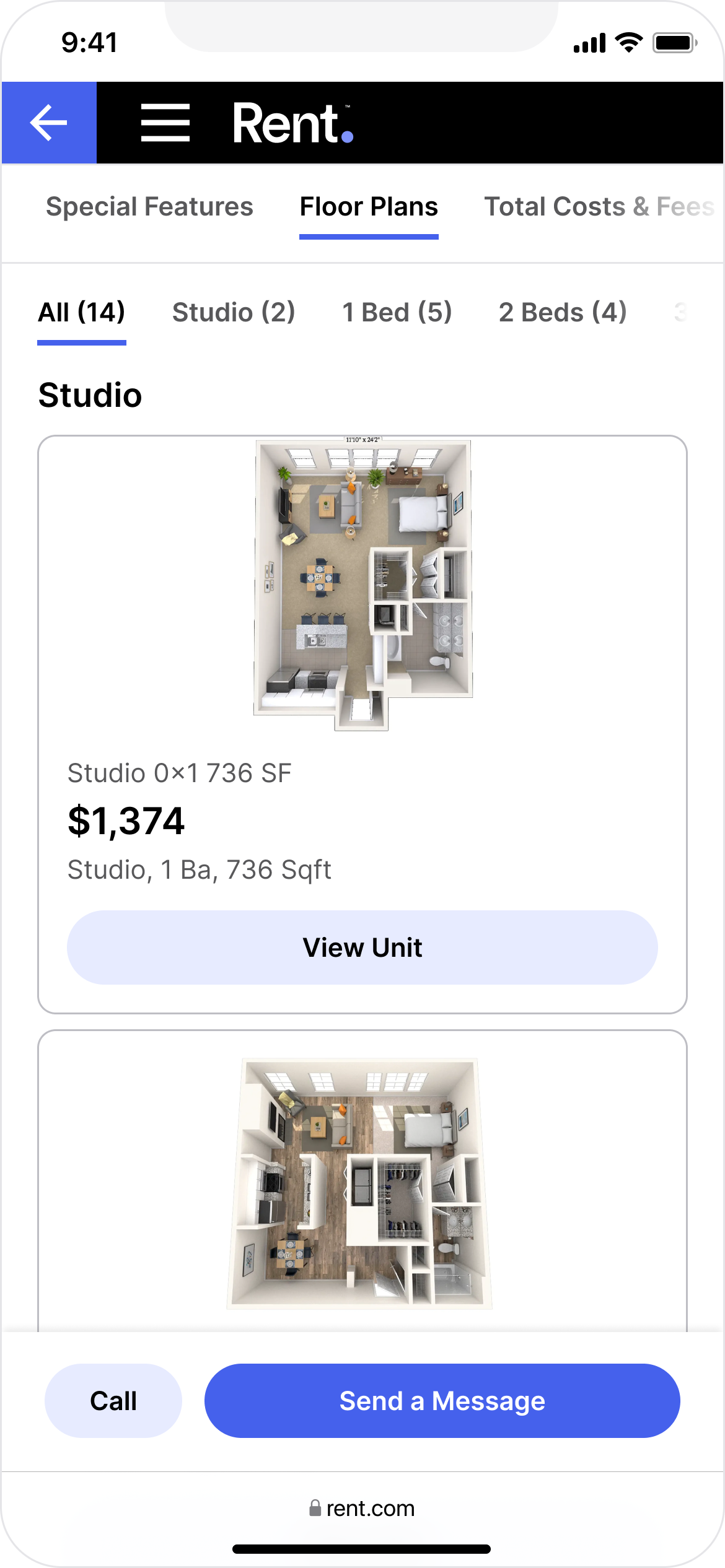
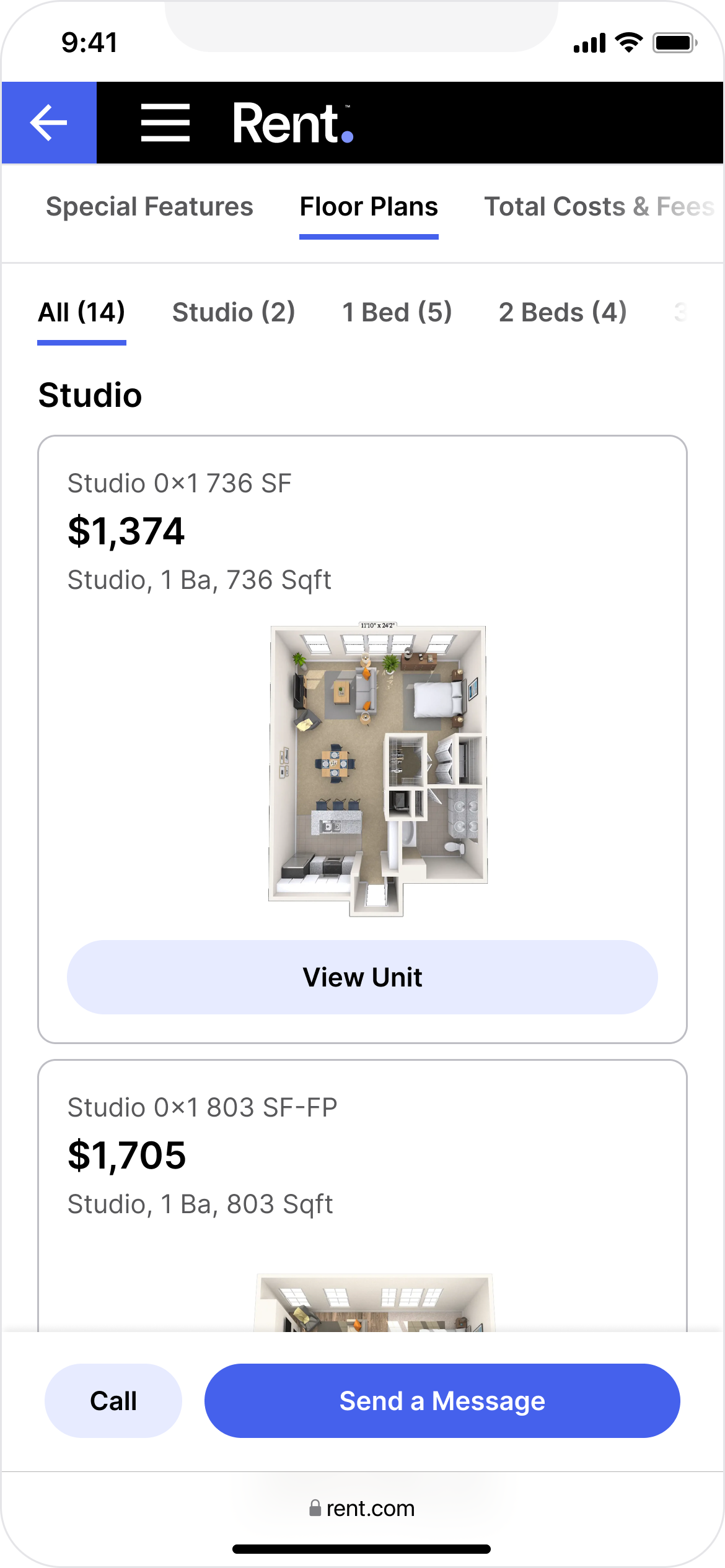
I proposed testing two information hierarchies: the larger floor plan image first, or price and floor plan details first.
The results showed that placement mattered more than image size alone. When the larger image appeared after price, it had no meaningful impact on conversion. Shown first, it increased paid conversion by 3%.
Control
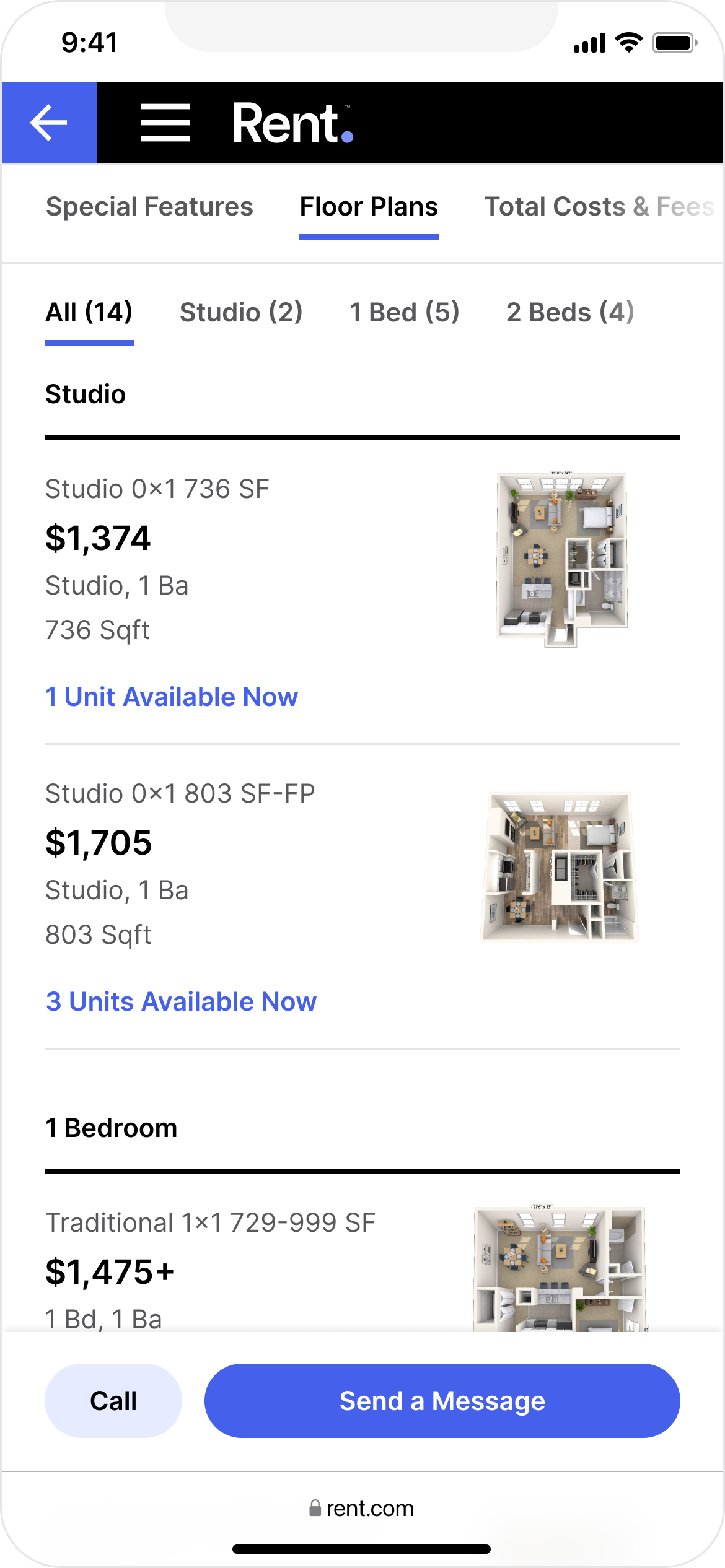
Image on top
Price on top
Does it hold elsewhere?
After seeing the impact of image placement on mobile, I pushed to include an image-first variant in the desktop test. It held conversion flat, while a direct copy of Redfin.com's design reduced conversion.
Winning variant
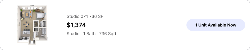
Redfin direct copy
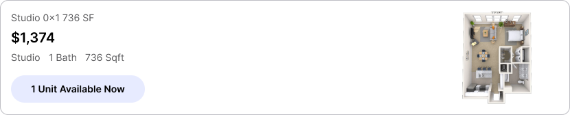
What if the section gets completely redesigned?
Later, another designer explored a side-by-side layout to make floor plans easier to compare. The direction prioritized price, based on the assumption that it was what renters most wanted to compare.
I shared what we'd learned and advocated for keeping an image-first variant in the test, so the team could evaluate the side-by-side layout without relying solely on the price-first variant.
That distinction mattered. The image-first variant lifted paid conversion by 6.5%, making it a winner against the control, while the price-first approach underperformed the control. The team moved forward with the side-by-side layout using the winning information hierarchy.
Winning variant
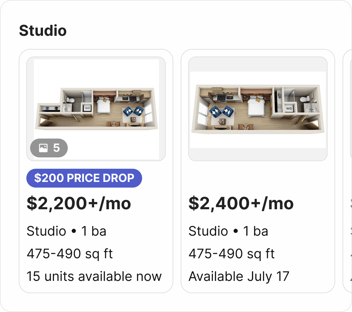
Original proposal
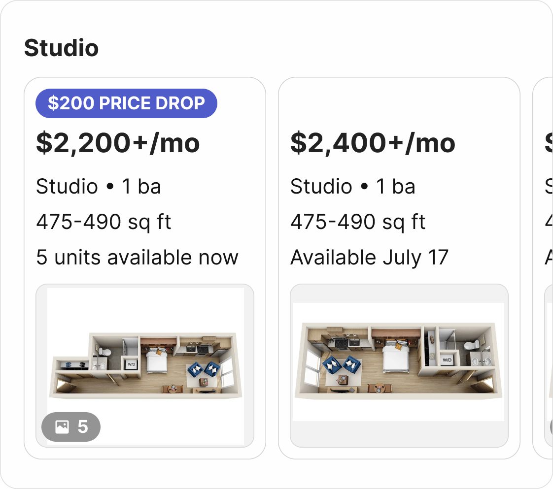
The team continues to iterate on the floor plan experience, and I continue to advocate for keeping the image first and price second in the information hierarchy.