Rental Partner Portal Redesign
Rent's partner portal helped property management companies manage their listings and the products they'd purchased from Rent. It also gave Redfin's Sales team a place to manage client accounts.
Discovery
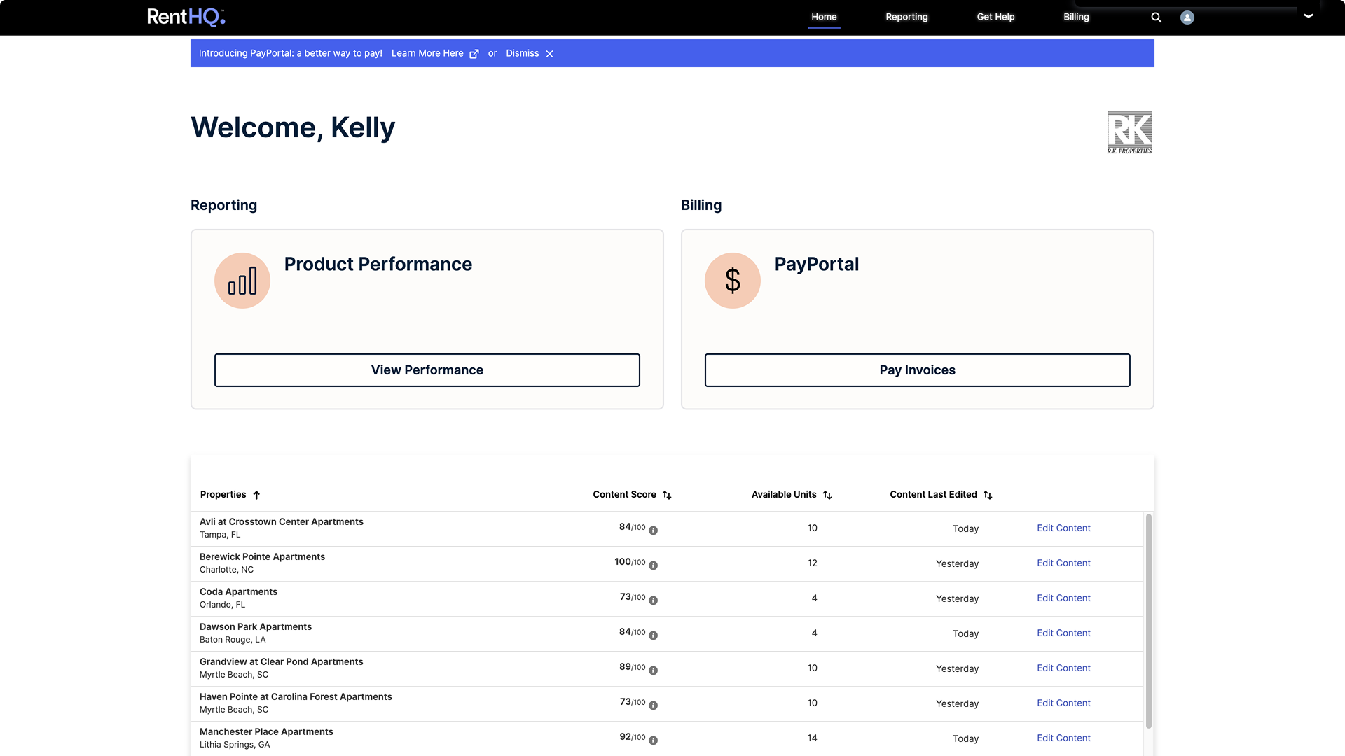
The client homepage led with Reporting, with a list of properties underneath. My conversations with Sales and clients showed that wasn’t where they started. Many clients cared little about our reporting, whether because of their role or because they had their own. Property managers started on consumer listing sites, where they reviewed how their properties looked, and went to the portal only when they found something to fix.
Those conversations pointed us to organizing the portal around properties instead of products.
Exploring navigation
That raised a more complex design challenge. Properties, tools like the CMS and reports, product families, and individual products all had to fit together, with upsell opportunities mixed in. I explored different ways to connect these layers, prototyping how users could move between a property and its tools.
Three directions I prototyped while exploring how users could move between properties, tools, and products. The final navigation took a different direction.
Design
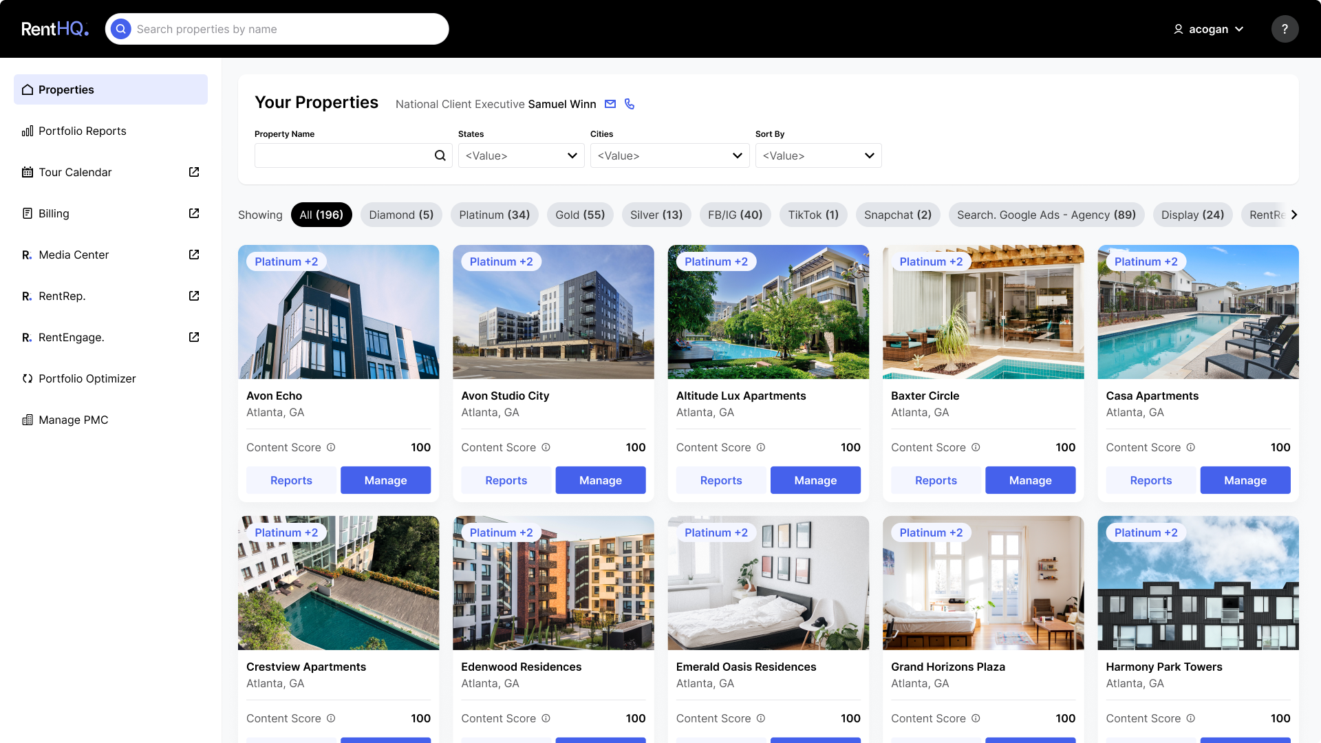
With new dev support, clients now land on a grid of their properties that mirrors the consumer site they just reviewed. Each card shows the two numbers they care about, content score and leads, with Manage as the primary action and Report as the secondary one.
Before
After
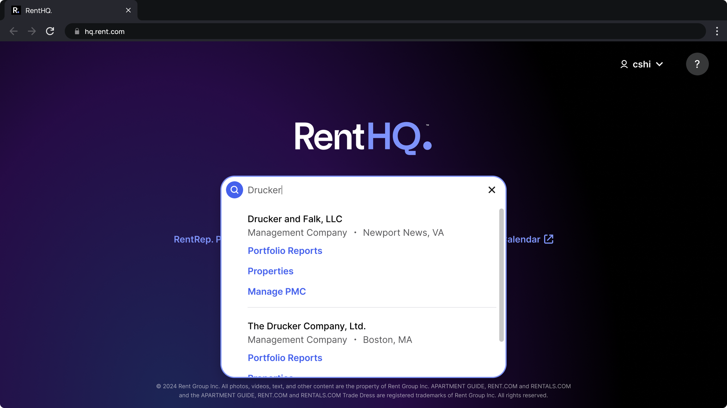
Sales used to get a long, browsable list of property management companies. Looking up a client is central to how they use the portal, so I replaced the list with search as the focus of their homepage. Results link straight to Reporting: one click completes both the search and the navigation.
After
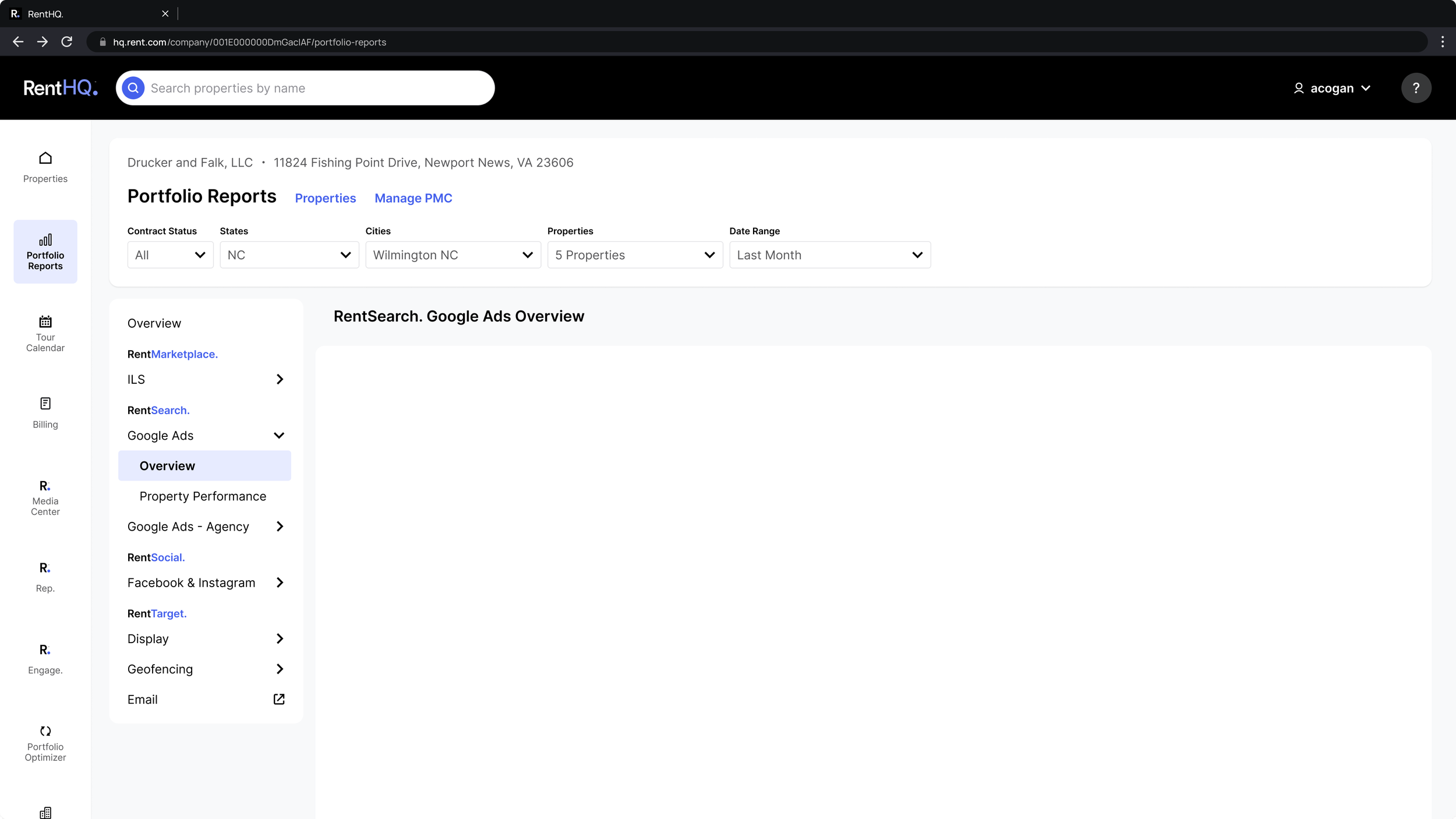
Reporting followed the same property-based structure. Sales showed us how they review performance with clients, usually regional managers: a walkthrough of how our products perform across their properties. So region and property filters now carry across reports, letting a rep set up a client’s properties once and stay there.
Navigation shows only the products that apply to those properties, which gives Sales and clients an easy view of what was purchased and which results to check, with no lookup and no waiting on Sales to pull the history.
Before
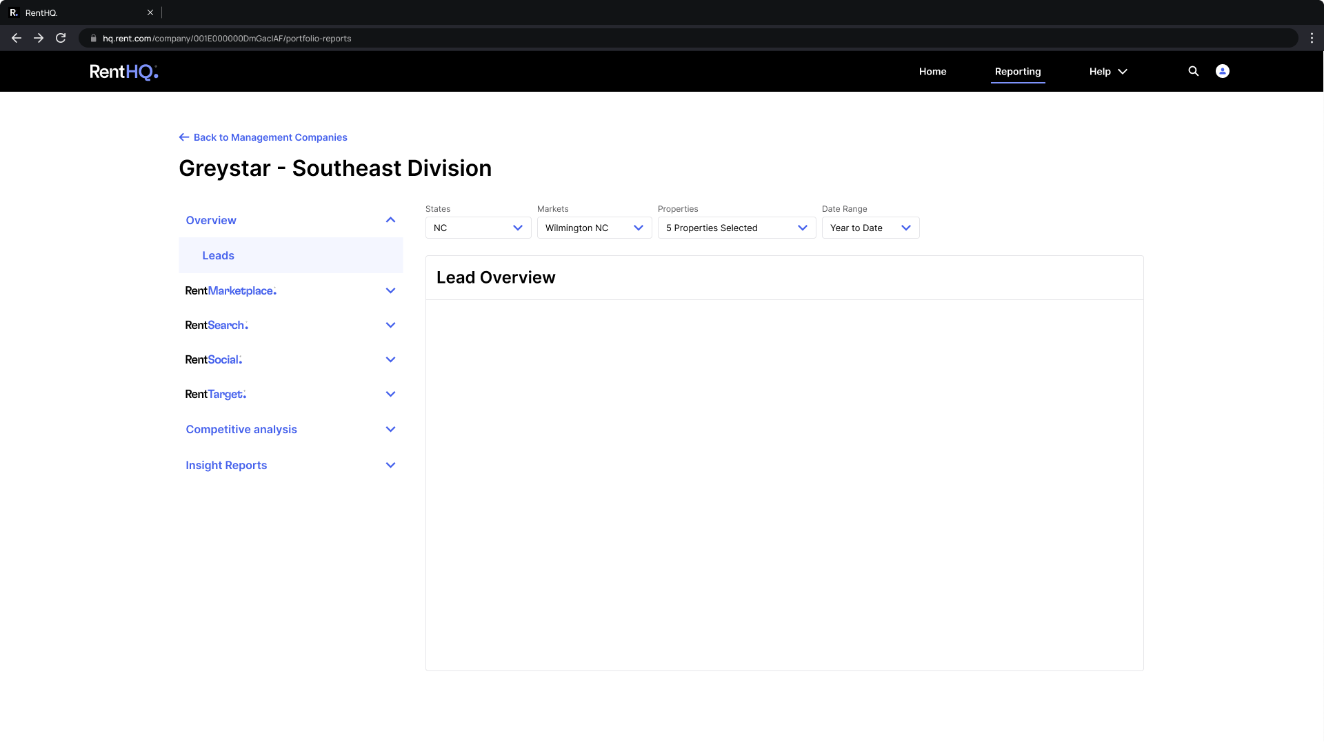
After
Testimonials
“Charity learned how our clients interacted with every part of the RentHQ portal and what challenged them, not just with the portal but with everyday tasks they performed in their systems that flowed through to RentHQ.” – Whitney, former Director, Client Service & Retention
“Charity understood that the portal needed to work for both our Sales team and our customers, and she was always willing to brainstorm ideas and figure out what made the most sense.” – Ani, former National Client Executive
Reflection
The more I talked to the people using the portal, the more I could picture their day: a property manager spotting something to fix on a listing, or a sales rep walking a client through their property's performance. I started to see the portal through those moments, not just through its products and features. Once I understood what people came here to do, a different structure became obvious.