
REMOTE CONTROL APP FOR SMART TVs
Remote control app on smartphone is always a desired add-on for today's TV users. It also makes a great design challenge to ensure a smooth multi-modal experience.
Hisense was improving its first official remote control app. I conducted interaction analysis and provided design principles with hi-fi examples to help guide the team.

Design for The Other Screen
People use remote control app to save the hassle looking for the physical remote:
" When I'm lying in bed at 5am after binge watching Netflix, I don't wanna have to get up to turn the TV off" -- TV Remote user on Google Play
Unlike many other apps, remote control may want users to spend the least time in it. To do so, I architected the app to launch the right interface intellectually based on the context and user’s goal.

Design for Multiple Screens

Touch-screens miss the tactile sense of physical buttons and require extra visual attention that sometimes be competing against the TV content. Remote control apps must work with these constrains. The goal is to provide one-stop solutions to minimize shifts in attention.

When text input is required on the screen, the user can type, review and navigate to next input within the mobile app.
Validating the learnability in new designs
To ensure the touch-operating, we adopted drag and swipe gestures widely in the app. Would average users easily pick up these new interaction methods? We conducted interviews in the early stage.

Temporary high-fidelity mockups were created to prevent participants from being distracted by a lack of details.

The new channel "up" and "down"
The overall feedback was generally positive. One learning was to improve the structure of information and follow existing conventions in TV software (and be creative when migrating to mobile apps).
We ran rounds of iteration based on the interview results to make sure that the design delivers clear message about the interface's capability.
Designing for holism and modality
Puzzling together, every element was carefully chosen and placed to ensure it serves its function and the entire interface well. Despite that real-word analogs are less used today, I borrowed concept from physical controls after exploring other options: it works the best to communicate the hierarchy and how the UI changes with interactions.

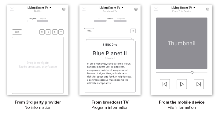
The modality is also used to adapt to various scenarios and prevent the UI from growing overwhelming.
Visual style with a purpose
After researched other remote apps, I suggested dark and neutral color theme for following reasons:
Resembles remote control color choice in real world
Versatile with third-party visual assets
Eye-friendly to in a dark room at night


I also intentionally chose a style with a sleek dimension so the UI presents clear signifiers it needs. Other visual elements such as thumbnails are used reservedly, even eliminated, to keep the interface away from being distracting. Highlight colors are chosen and icons are designed to reflect the TV platform and brand identity.
Let me know your experience using remote control (app or the traditional one) with the TV -- I'm always open to hear user stories and improve my design!