
Go! Wireframes!
I'm ashamed to admit that I don't really have a good habit of keeping my wireframes. Sometimes my brain just works faster than drawing all of them out, and I'm pretty good at building a highly-detailed image in my mind. (To excuse myself, I've been through over a decade of painting training and my strength was figurative thinking.) But my friend at Google kinda warned me recently. So I start to record (almost) every changing idea with sketches and multiple artboards.
Surprisingly I found myself captured a lot of tiny sparks or logics behind the scene. Are they making my final design more thoughtful than it could have been? Actually probably not. But they definitely tell a much richer story about how my design is formed, and more importantly, who I am as a designer.
To give you some background, I am a UX designer mainly for smart TVs and I am currently working on an entertain application that has a Home screen, an account, a search engine and some channels that help sort content and allow subscription. We are still very in a very early phase so I am only going to use very vague names for the features.
First, I pictured a heading bar like this:

I even drew several iterations and screens with it:

Doesn't look bad, right? But may I remind you that that smart TV's users cannot hover on a screen like a computer or a phone. So later I realized that this is what they would see:

Without saying, I changed the layout immediately into:

I was struggling a bit with the design for Channel interface. At the beginning I had a tab-like design, but I wasn't sure about a busy layout like this:

Or a design where the user has to click twice to reach the content:

Or an interface with white space like this on a 50" TV screen:

Plus a bigger issue is that the user cannot conveniently switch to another channel. The least the user needs to do is navigating to a "Back" button that takes him/her to the entire list of channels.
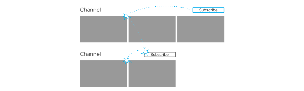
One thing I learnt from working with develop team is to keep interfaces as consistent as they can -- not from a user experience perspective. Today I also learnt another thing is that if you are stuck with one interface early on, move on and you may get some insights later. So when I was drawing Subscription interface, I thought that I found some better alternative:

However, if you remember what I mentioned above, there is something nasty going on on such an interface:
With this alternative denied, I went back to review previous sketches I made. Of course my sketches alone are not enough, I also took reference from other TV apps and viewed them on actual TVs. Considering all aspects, I decided to keep the original tab-like interaction:

This design works within the Home screen instead of generating a separate interface. It allows changing channels easily; And there are very few rows/components that doesn't confuse users.
The last thing that has being disturbing me a little was the menu for My Account. An idea came to my mind immediately was a drawer, as it is what YouTube and many other big names are using:

However, we would only have very few items in the list, one-third of the screen could be an overkill. I thought of a dropdown/pop-out menu:

But this menu cannot support Subscriptions feature to expand in a clean way while the user keeps adding content. It would require the user to enter a Subscription interface before selecting one channel. As we learnt above, multiple channels in one interface may not be a brilliant idea. A drawer would serve this purpose, yet another issue is that I have moved My Account button to the right, so a drawer could read weird sliding in from the right side of the screen:

So what we need is something that is flexible for both nearly-empty and overloaded space. Again, by reviewing my other sketches, I finally decided to use a layout visually consistent with channel tabs -- a menu formatted horizontally:

With the new design, the Subscription interface is consistent with Channel interface as I had wished for before:

By setting out the process of my wireframing, several rules regarding designing interface for smart TVs revealed themselves to me. I have encountered such cases before, but with a more definite example, I'd like to state them explicitly here.
Current guidelines could be found online only suggest that "A clear up-down and left-right orientation should be immediately apparent" (Design and User Experience Guidelines, Amazon Fire TV), but we may also want to note:
If there are more than one controls in a row, remember to place them right next to each other.
Since it is very likely that we are designing a content service for a smart TV, be careful with multiple categories in one interface. Similar as above, do NOT break down rows full of entities with scattering controls. (Controls = components that is capable of receiving focus; Instructional messages for RC buttons are not counted.)
A side note: Place such controls at the top-most or bottom-most location.
The TV screen is landscape. Consider tabs before lists.
Undoubtedly, I've learnt a lot through this exercise. I can't guarantee that every project could provide the same experience -- I know some of my past ones certainly wouldn't have. However next time I run into a case like this, I'll make sure to capture the process.
The guidelines above are still very rough at this point. Let me know if you know any exemptions that could help polish them.